My involvment with gnuplot
I started using gnuplot to plot data and prepare figures for
publication early in my career. In 2004 I joined the gnuplot
development team to contribute some bits I had written locally
to improve the presentation of data from my lab.
I have continued to add new capabilities to gnuplot, either
because I need them for my own use or in response to requests
from other gnuplot users. Eventually I found myself acting
as a lead developer for the project.
This web page has samples of some features in gnuplot that I had
hand in developing.
Motivated by work in crystallography
- Voxel data
-
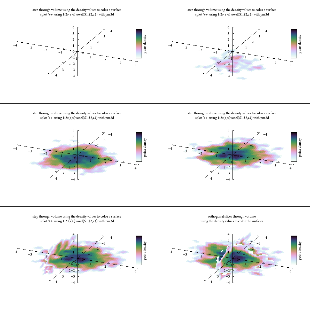
Gnuplot now supports the use of voxel grids in which every point ("voxel")
in a regular 3D lattice is assigned a value.
It provides several modes for visualizing the voxel data, but these can all be
considered work in progress.
Displaying voxel data is hard!
-
Crystallographers generally compromise by displaying a single
isosurface derived by contouring the continuous electron density values
in a voxel grid that is a Fourier transform of their diffraction data.
That kind of isosurface representation is less useful for visualizing an
arbitrary voxel grid.
Here are a couple of alternative visualizations that use palette colors
mapped from voxel values onto points or onto 2D planes through the volume.
-
These are gif animations.
If you see only a static image, try loading the animated gif into a
separate new browser tab.
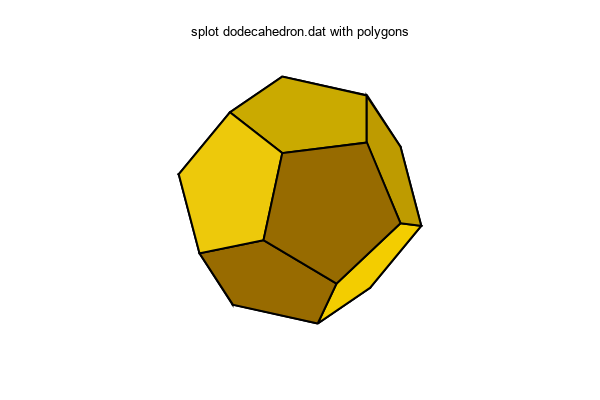
- polygons in 3D
- 3D plotting mode "with polygons" lets you build an arbitrary polygon
or surface from faces whose vertex coordinates are read from a data file.
Geographic data
My life is spent in atomic coordinate space more than in
geographic latitude/longitude space.
But maps are sooo nice for conveying information tied to specific locations.
Here is a proof-of-principle demonstration of pulling geographic
coordinates from a standard format
(GEOJSON) file and using them to create a map in gnuplot.
- data file from the geojson project pages: US states as multipolygon features
- I don't yet have a real parser for this format, so I used a stupid ed
script to place each vertex on a line of its own.
json_to_dat:
    #!/bin/bash
    sed -e "s/] ] ]/] ]/g" | \
    sed -e "s/]/\n/g" | \
    sed -e 's/coordinates":/coordinates":\n/' | \
    sed -e 's/^[,]*[ \[]*//' | \
    sed -e "/}$/d"
- Then I can plot it in either 2D (plot ... with filledcurves)
or 3D (splot ... with polygons). Here is a 2D jiffy plot:
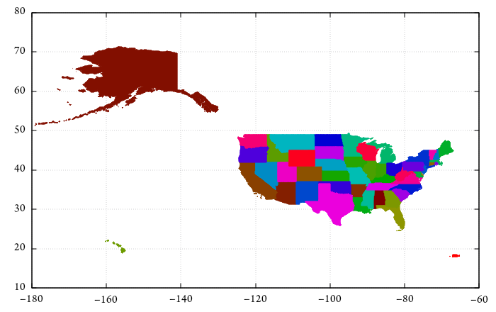
$ json_to_dat < gz_2010_us_040_00_5m.json > USA.dat
$ gnuplot

    set palette model HSV defined (0 "#00ff7f", 1 "#ffffff")
    set cbrange [0:51]
    unset colorbox

    set xrange [-180:-60]
    set yrange [10:80]
    set datafile commentschar "{"
    unset key

    plot for [i=0:*] 'USA.dat' skip 3 index i with filledcurves fc palette cb i
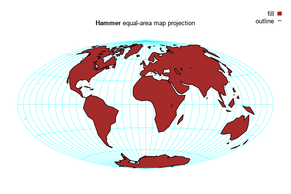
- OK, that projection sucks. But wait, gnuplot can now do map projections.
To the right is one of the samples from the on-line demo collection:
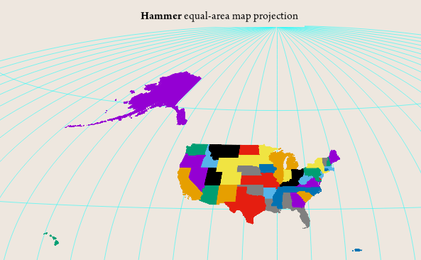
- Now I just need to combine the two capabilites.
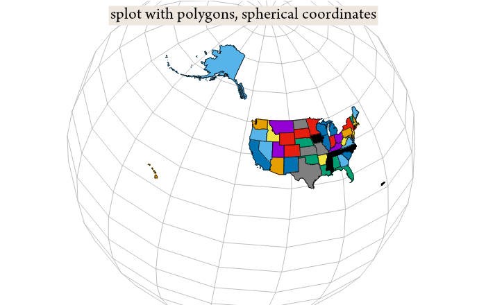
- And finally, the same data plotted in spherical coordinates
onto a globe, using splot with polygons.